Eggy Mail has received a substantial frontend update today focused on improving how emails are displayed, cleaning up the message reader and making the mobile experience much more practical.
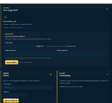
Integrated directly into XenForo, allowing existing Eggy Mail users to manage their inbox while welcoming new users to the service.
Improved rich email rendering
Previously, HTML emails could lose much of their original presentation when opened in Eggy Mail.
Emails from services such as Amazon and other commercial senders could appear heavily stripped down, with missing colours, broken spacing, excessive table borders, missing imagery and layouts that looked more like raw HTML structures than finished emails.
The message renderer has now been updated to better preserve safe HTML email presentation.
Emails can now retain much more of their intended:
• Colours and backgrounds
• Layout and spacing
• Tables and formatted sections
• Buttons and links
• Product imagery
• Sender branding
• Typography and general presentation
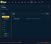
Remote images are now also loaded automatically when opening messages, allowing supported emails to display much closer to how they appear in established email clients.
Email content continues to be isolated from the main Eggy Mail interface for security.
Message reader cleanup
The email reader has received several interface improvements.Broken or unsupported icons have been removed from controls where they were providing no useful visual information.
The Restore action in Trash is now presented cleanly without its broken icon.
Several reader controls have also been simplified on smaller screens, including removal of unnecessary blank icon buttons that could previously appear when an icon failed to render.
The result is a cleaner and more consistent toolbar regardless of whether a message is being read from Inbox, Trash, Spam or another folder.
Mobile inbox improvements
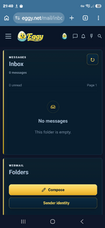
The mobile inbox has received a larger usability pass.Previously, the Folders card appeared before the Inbox when the desktop layout collapsed onto a phone, meaning users could have to scroll before reaching their actual messages.
The mobile order has now been changed so the message list takes priority:
Inbox / Messages
Folders
The redundant Webmail Inbox information card has also been removed from the mobile layout.
Instead, the currently signed-in email address is now shown below the mail cards alongside a dedicated logout button.
This keeps account information available without taking up valuable space at the top of the mobile inbox.
Mobile reader improvements
The message reader has also been refined for phones.Toolbar spacing and action placement have been cleaned up, unnecessary controls have been removed, and the overall layout now makes better use of the available width.
The aim is to keep the important actions accessible without filling the reader header with controls that are not useful on a small screen.