Eggy’s homepage, BNC dashboard, mobile navigation, and Web BNC have received a polished UI and UX refresh, delivering clearer account details, improved spacing, smarter mobile controls, and a cleaner, more consistent experience across the service.
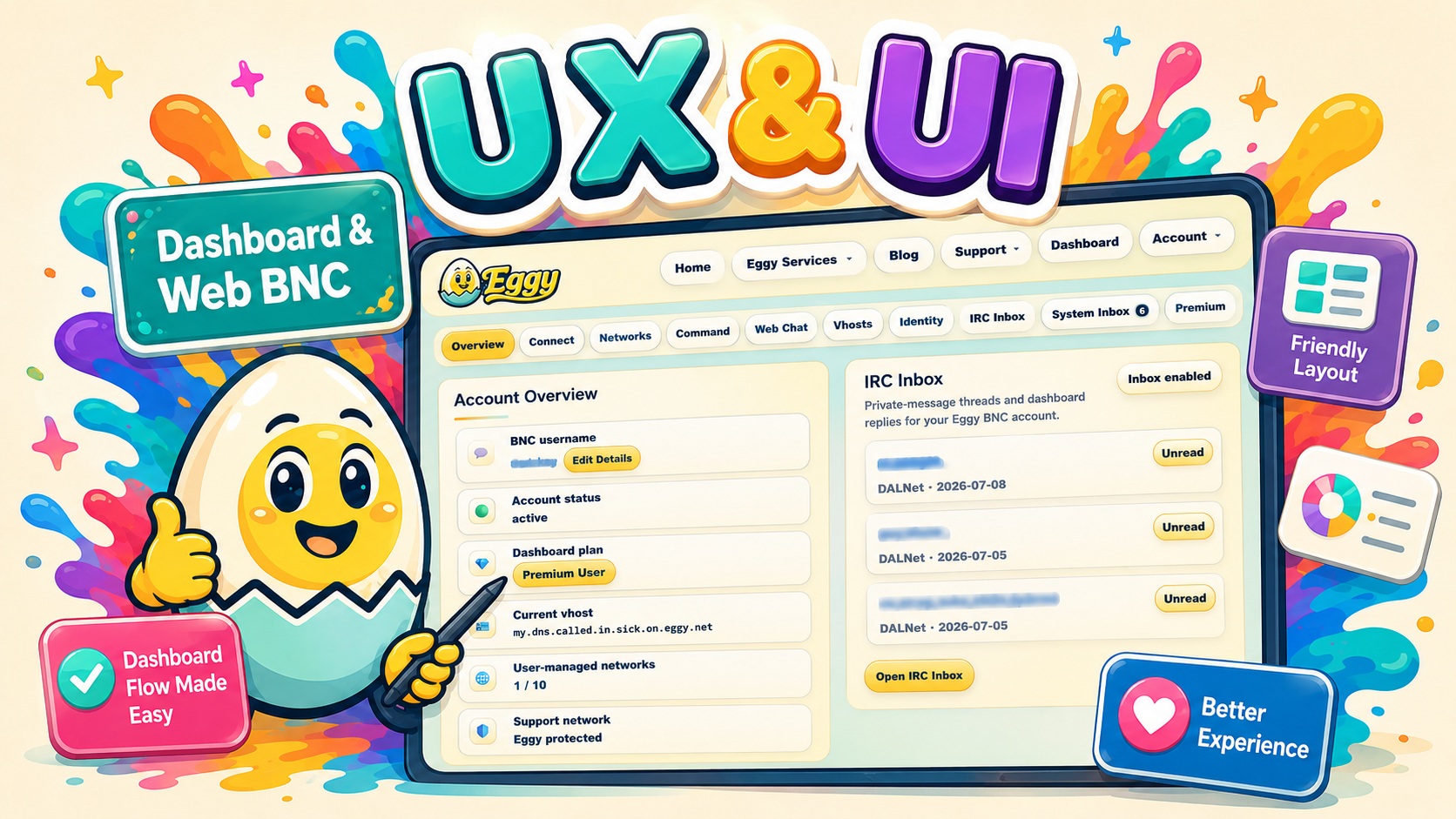
Eggy has received a major UI and UX refresh across the homepage, BNC dashboard, and Web BNC experience.
This update was not about changing how Eggy works behind the scenes. It was about making the service cleaner, easier to understand, faster to navigate, and more comfortable to use across desktop and mobile.
A More Polished Homepage
The Eggy homepage now has a cleaner and more consistent visual style, with improved spacing, clearer navigation, stronger content hierarchy, and better responsiveness across different screen sizes.
Visitors can more easily find the areas that matter most, including Eggy services, support, the dashboard, account tools, and Web BNC access.
The updated design keeps Eggy’s familiar navy, cream, aqua, and gold identity while making the overall experience feel more modern and refined.
A Better BNC Dashboard Overview
The Dashboard Overview has received the biggest visual improvement.
Account details are now presented in compact, clearly separated information cards, making it much easier to scan important information at a glance.
The updated Account Overview includes dedicated icons for:
- 👤 BNC username
- 🛡️ Account status
- 💎 Dashboard plan
- 🪪 Current vHost
- 🌐 User-managed networks
- 💬 Eggy support network
Labels are now more prominent, values are displayed clearly underneath them, and technical information such as long vHosts can wrap safely without breaking the layout.
The Edit Details control now uses Eggy’s gold action styling, helping it stand out as an important account-management option.
Premium users also receive a clear gold Premium User status pill, while Free users retain the standard neutral plan styling.
More Compact and Focused Cards
Dashboard cards have been tightened and refined to reduce unnecessary empty space.
The Account Overview rows now use:
- stronger borders
- improved padding
- clearer label and value hierarchy
- smaller, better-aligned icon tiles
- cleaner card separation
The IRC Inbox card now sizes itself according to its actual content instead of stretching to match the height of the Account Overview card.
This creates a more balanced Overview layout while keeping the IRC Inbox in its original position.
Improved Mobile Dashboard Navigation
The old mobile dashboard navigation previously displayed every section as a large multi-row grid, taking up much of the screen before users could reach their account information.
That has now been replaced with a custom Eggy-styled mobile section menu.
The new control:
- defaults to Overview
- displays the currently selected dashboard section
- expands to reveal the existing dashboard tabs
- preserves IRC Inbox and System Inbox unread badges
- closes automatically after selecting a section
- uses the existing dashboard navigation system underneath
Desktop navigation remains unchanged.
This significantly reduces wasted space and allows mobile users to reach their account information much faster.
A Cleaner Overview
The redundant Your BNC Connection card has been removed from the Overview.
Connection details and commands remain available through their dedicated Connect and Command dashboard tabs, so no functionality has been lost.
This keeps the Overview focused on the information users are most likely to check regularly:
- account identity
- current plan
- vHost
- network allowance
- support status
- IRC Inbox activity
Web BNC Visual Improvements
The Web BNC experience has also been brought closer to the updated Eggy design language.
Navigation, controls, spacing, and responsive behaviour now feel more consistent with the homepage and dashboard, creating a smoother transition between browsing Eggy, managing an account, and accessing IRC.
The goal is for every part of Eggy to feel like one connected service rather than a collection of separate tools.
Built for Desktop and Mobile
These changes were tested across both desktop and mobile layouts.
Special attention was given to:
- long usernames and vHosts
- narrow mobile screens
- touch-friendly buttons
- readable account information
- compact navigation
- consistent action styling
- preserving existing dashboard functionality
No account data, networks, messages, or BNC functionality were removed as part of this update.
The Same Eggy, Just Better
Eggy remains focused on providing a reliable and accessible BNC service.
This UI and UX refresh makes that service easier to use, easier to understand, and more enjoyable to manage—whether you are checking your account from a desktop computer or connecting from your phone.
Log in and explore the updated experience through the Eggy dashboard.